The quiet art of making type
do more with less.
A practical way to build hierarchy, find the right contrast, and give a composition room to breathe.
Good design starts with paying attention. Ideas, observations, and useful things for a more thoughtful creative practice.
Find your next idea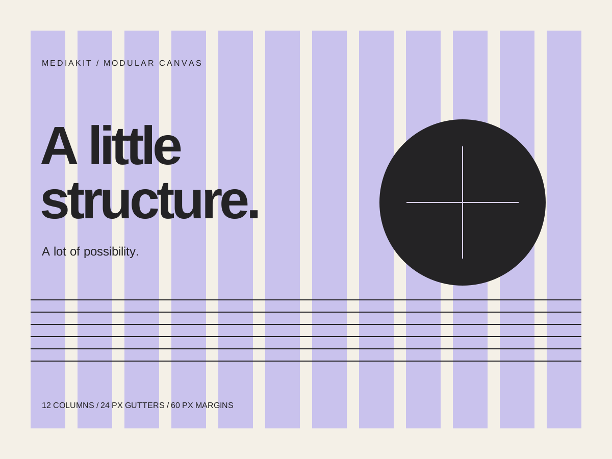
For the endlessly curious.
A practical way to build hierarchy, find the right contrast, and give a composition room to breathe.
Original little starting points. Download them, take them apart, make them your own.
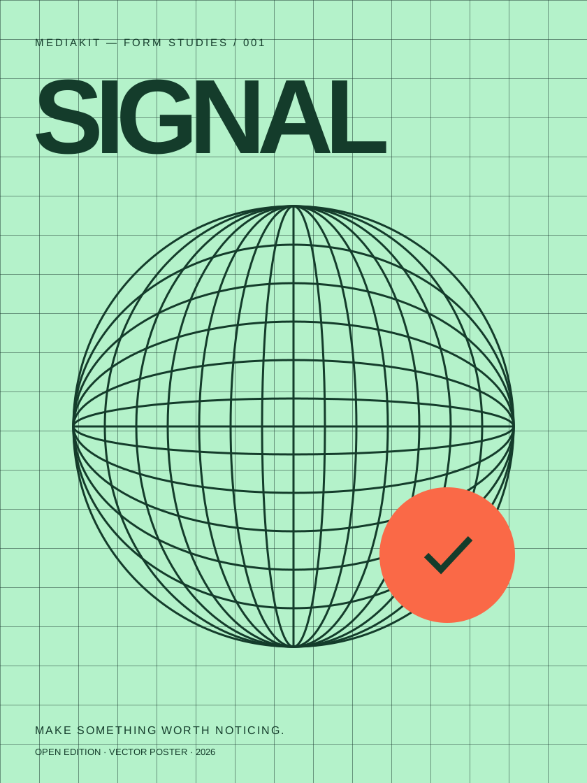
A typographic poster exploring rhythm, repetition, and a single point of contrast.
A twelve-column layout study. A useful frame for your next editorial experiment.
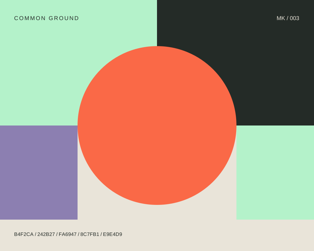
Five colors, a few simple shapes, and plenty of possibilities. All hex codes included.
Free for personal and commercial use. Edit, remix, and use in your projects; attribution is appreciated. Please don’t resell the original files as standalone resources. SVGs open in a browser or your preferred vector editor.
MediaKit is an independent design journal and a small library of original resources. A place to step back from the feed and look a little closer at the choices that shape what we see.
We explore typography, color, and composition through practical notes and visual experiments. No secret formula. Just considered ideas, useful starting points, and the pleasure of making something well.