A palette is a set of decisions.
Start with what each color needs to do. A beautiful collection of swatches becomes useful when every shade has a role.
Name the roles before the shades.
It is easy to collect five colors that look good together. The harder question is what happens when those colors become a page, a poster, or a series of social images. Which one holds the background? Which one carries text? Where should someone look first?
Start with roles: a surface, a readable ink, a supporting tone, and an accent. You can fill those roles with four colors or with variations of two. What matters is that the palette gives you repeatable decisions. Without roles, each new composition becomes a fresh negotiation.
Proportion changes everything.
Two designs can use exactly the same colors and feel unrelated. A page that is mostly charcoal with a small mint link feels different from a mint page with a charcoal headline. The relationship depends on area as much as hue.
Make three rough studies with the same palette. In the first, give the lightest color most of the space. In the second, let the darkest color lead. In the third, increase the accent until it becomes a field. Do not polish the shapes. The purpose is to see how proportion changes the mood before you invest in detail.
A useful palette has a point of view—and a plan.
Separate expression from information.
A coral circle can be a lovely interruption in a quiet composition. The same coral may be difficult to read as small text on cream. A shade does not become a good text color simply because it belongs to your palette.
Check the actual foreground and background pair used for reading. For digital work, the WCAG contrast minimum is 4.5:1 for ordinary text and 3:1 for large text. Contrast is a starting point; thin letterforms and small sizes can still feel fragile. Check the result at its intended size.
Do not make color the only carrier of meaning. A selected item can have a label or a visible border as well as a changed fill. A link can be underlined. These choices help people with different color perception and make a composition clearer in poor lighting.
Build a small working palette.
- Choose the surface and ink together. They will shape most of the reading experience.
- Add an accent with a specific job. Reserve it for a meaningful point of attention.
- Try one awkward use case. Put a long caption, a small label, and a muted border into the study.
- Record the values. A palette becomes easier to reuse when its hex codes travel with it.
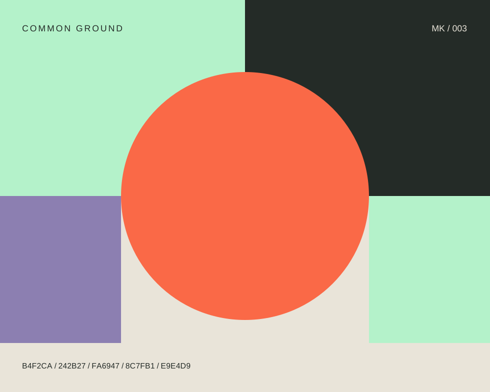
Our Common Ground color study includes five starting colors. Open the SVG and try removing one. Then reverse the proportions. Treat the file as material to question, not a finished answer.