Structure makes room for surprise.
A grid is a set of relationships. Use it to make everyday decisions easier—and the deliberate exceptions more interesting.
Begin with a relationship.
A grid does more than divide a page into equal strips. It creates relationships between things: the edge of a headline and the edge of an image, the width of a caption and the space around it, the rhythm of one spread and the next.
You do not need twelve columns to get that benefit. Two edges and a consistent gap can be a useful grid. Start with the material you have, then choose the simplest structure that lets related things sit together. A system should earn its complexity.
Give repetition something to repeat.
Choose a few steady decisions: an outer margin, a gap between neighboring elements, and the position of small labels. Repeat them. This makes the composition feel connected without requiring every element to be identical.
Try laying out three article previews. Let one be larger than the others, but align its title with a shared edge and use the same spacing between metadata and headlines. The cards can have different proportions while still feeling part of the same publication.
Consistency gives an exception something to push against.
Break one rule on purpose.
Once the basic relationships are clear, choose one element to escape them. A headline might cross a column. A small illustration could sit in the margin. An image could stretch wider than the text. The break is more effective when the rest of the page stays calm.
If every element breaks the grid, there is no shared expectation left to interrupt. When a composition feels chaotic, remove exceptions one at a time. Often the strongest idea was already there; it just needed fewer things competing with it.
Let the small screen have its own logic.
A desktop grid describes one set of available proportions. It should not force a phone to display a miniature desktop page. A wide feature and a narrow sidebar can become a single sequence. The important relationship may be reading order rather than horizontal alignment.
Decide what someone needs first, then check that the source order supports that sequence. Keep text readable, preserve generous enough touch targets, and let images change shape when the composition calls for it. A responsive system keeps the intent even when the geometry changes.
A useful afternoon exercise.
- Open Modular Canvas, our twelve-column starting point.
- Replace the example copy with a title, a paragraph, and three short captions.
- Make one layout using six columns for text and six for an image.
- Make another using eight columns for the main idea and four for supporting material.
- Hide the column guides. Keep only the relationships that make the content easier to understand.
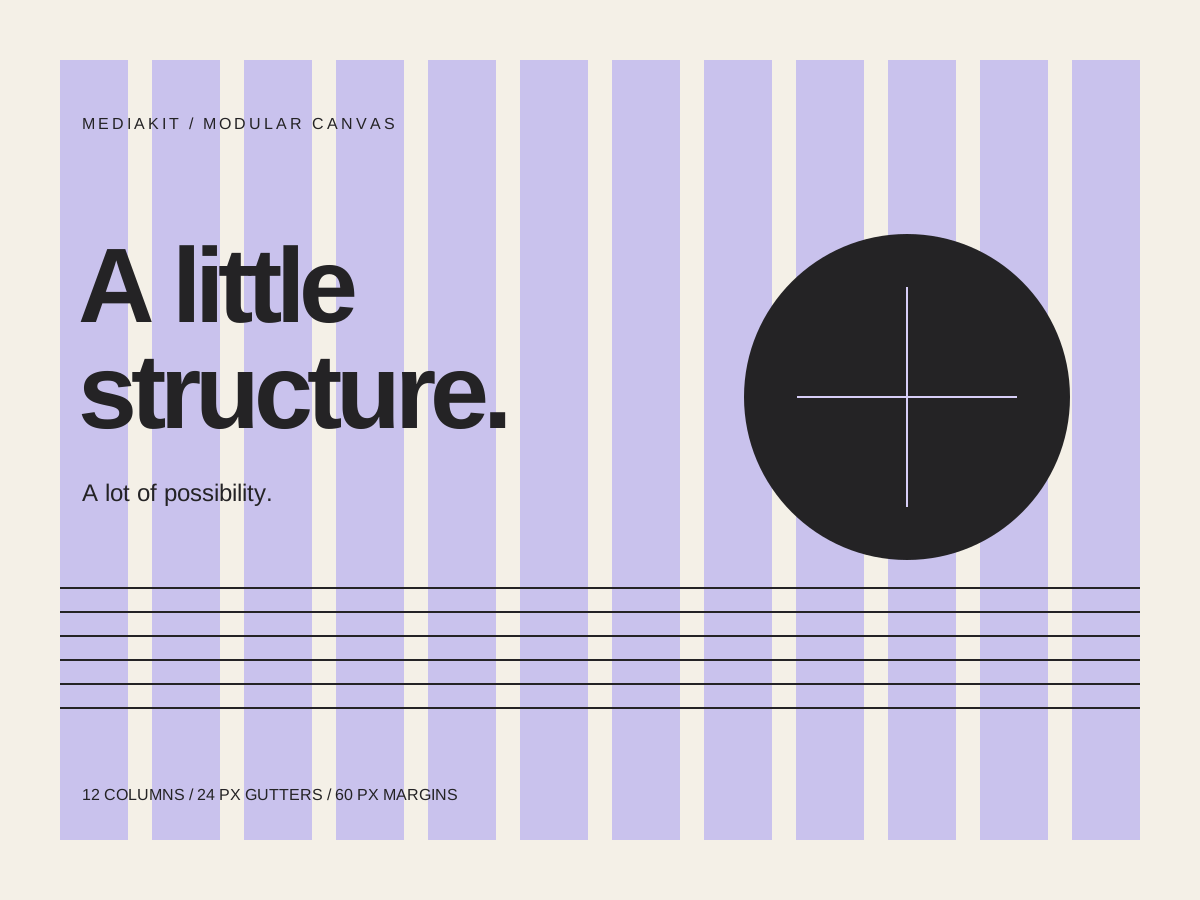
The guides are there to support a decision, not to justify it. When the material needs a different structure, change the structure.